A logo that looks sharp on a printed page does not automatically translate to a readable brand mark on a branded foam windshield at broadcast distances. The material, viewing conditions, and camera behaviour in live production impose specific constraints on what works and what does not. Understanding these constraints before submitting artwork saves revision cycles and produces a result that performs consistently across production contexts.
Table of Contents
Contrast is not optional
The single most important factor in logo visibility on a foam windshield is contrast between the logo and the background foam colour. Open-cell acoustic foam is a matte, textured surface that absorbs light rather than reflecting it — reducing the apparent brightness difference between adjacent tones. A logo with 30% tonal contrast from its background in a print proof will read at roughly 15–20% contrast on foam under typical studio lighting.
Dark logos on light foam, or light logos on dark foam, work reliably. Mid-tone logos on mid-tone backgrounds do not, regardless of hue. If the brand palette limits contrast options, adjusting the foam background colour is often more effective than compromising the logo. This is also why the Pantone system — covered in the Pantone colour matching guide — is the correct reference: it specifies the exact pigment formulation, so the contrast relationship between logo and background can be calculated accurately before production begins.
Scale and element size
The usable flat printing area on a single face of a three-sided or four-sided windshield is typically 30–45mm square. At these dimensions, fine detail disappears. Thin strokes, small type, intricate linework, and tight letter spacing become illegible at windshield scale.
Practical guidelines:
- Minimum stroke or line weight: 2–3mm at actual print size
- Minimum font size for legible text at camera distance: approximately 8–10mm cap height
- Maximum recommended distinct elements: 3–4
- Letterforms: bold or semi-bold weights perform better than light or thin weights
If the full logo does not simplify to these constraints, consider a standalone wordmark without supporting graphic elements, or a logomark only. Both are standard practice in broadcast windshield branding.
Single-colour printing
Single-colour logos produce the most consistent and durable results on foam. Colour registration on a textured, slightly compressible foam surface is more variable than on paper or rigid substrates. Fine multi-colour joins may shift slightly between production runs, which is more visible in complex logos than in simple ones.
Where multi-colour treatment is required, limit the palette to two colours with clear separation between solid fills. Avoid gradients entirely — foam does not hold gradient transitions accurately. Sharp colour boundaries between solid fills are the appropriate approach.
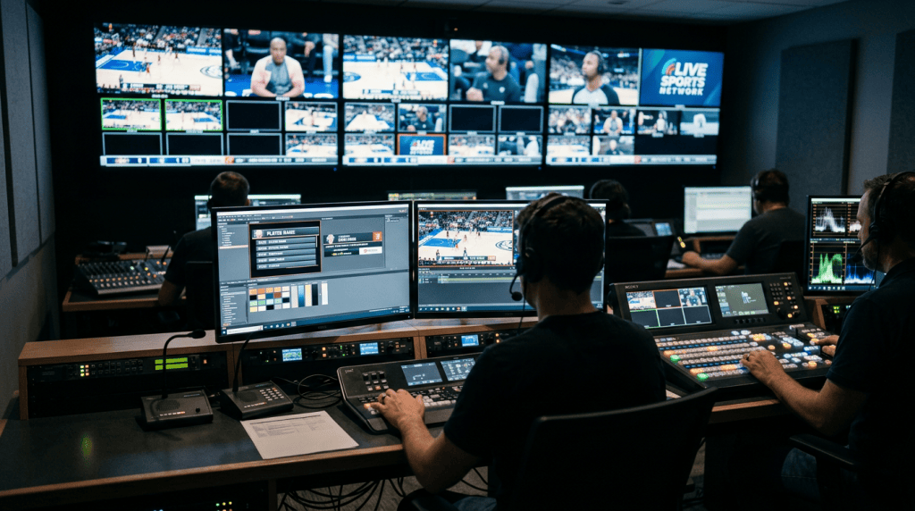
Visibility at broadcast distances
In the most common broadcast configurations — a two-shot interview, a wide establishing shot at a press conference, a reporter in the field — the windshield occupies a small portion of the frame. The logo must be legible at this scale, not merely visible.
The practical test: place the windshield at the typical camera distance, take a still frame, and evaluate whether the logo reads clearly without magnification. If it does not, the issue is almost always contrast, scale, or complexity — all addressable in artwork before production. The shape selection guide covers how windshield geometry affects which faces are visible at different camera angles.
File preparation
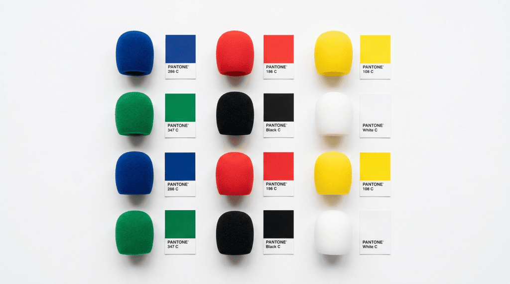
Supply artwork as vector files (AI, EPS, or PDF with outlined fonts) rather than rasterised images. Colour references should be supplied as Pantone Matching System (PMS) solid coated values — for example, Pantone 485 C rather than a CMYK or RGB equivalent. Foam windshield colour is produced through pigmented material, not surface printing, and only the Pantone solid system correlates to the available formulation range.
If brand guidelines only specify RGB or CMYK values, the manufacturer will provide the nearest Pantone equivalent for approval. Build this step into the brief timeline to avoid delays. Manufacturers with substantial broadcast production experience — such as Foam Conversion (UK) — operate with defined artwork review stages before production commences.
Logo Preparation Microphone Windshields FAQ:
Why does my logo look different on foam compared to print?
Open-cell foam is a matte, light-absorbing surface. It reduces the apparent contrast between colours compared to smooth printed substrates. Logos that appear high-contrast on paper may read as low-contrast on foam, particularly if the tonal difference between logo and background is under approximately 40%.
Can I use a gradient in my logo on a foam windshield?
Gradients are not recommended. Foam does not hold gradient transitions accurately — the result typically reads as an uneven patch rather than a smooth colour transition. Use solid fills with sharp colour boundaries instead.
What file format should I send to the manufacturer?
Vector files — AI, EPS, or PDF with fonts outlined or embedded. Include Pantone Matching System (PMS) solid coated colour references, not RGB or CMYK values.
My logo has very thin lines. Will they print correctly?
Lines thinner than 2–3mm at actual print size are likely to be lost or appear uneven on foam. If the logo relies on fine strokes, a simplified version adapted specifically for foam production is the recommended approach.